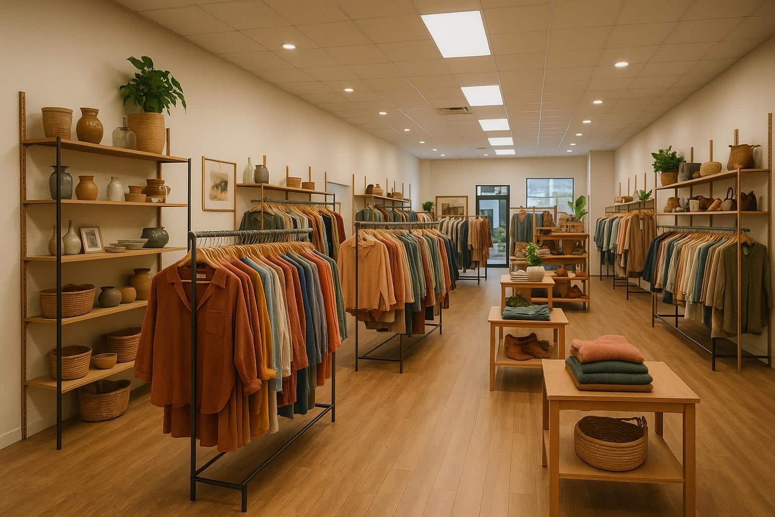
Want to boost sales and improve customer satisfaction in your thrift store? Start with your layout. Research shows that optimized store layouts can increase sales by 15%, while cluttered spaces may lose up to 64% of potential customers. Here’s a quick overview of the key tips to create a better flow:
- Eye-Catching Window Displays: Attract customers by showcasing standout items and seasonal themes. Refresh displays monthly to keep them engaging.
- Clear Entrance Space: Keep the first 5-15 feet clutter-free to create a welcoming transition.
- Angled Aisles: Use diagonal layouts to guide traffic and improve visibility.
- U-Shaped Sections: Organize products into inviting zones for easier browsing.
- Checkout Placement: Position the counter on the front left to create a natural flow.
- Seasonal Feature Walls: Update displays regularly to highlight timely merchandise.
- Movable Displays: Use flexible units to adapt layouts and showcase products effectively.
These strategies don’t just improve the shopping experience – they directly impact sales while making your store more inviting and functional. Let’s dive into the details.
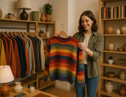
1. Set Up Eye-Catching Window Displays
Your window display is like a handshake – it’s the first impression your store makes, and it can influence purchase decisions up to 24% of the time. But it’s not just about placing items in the window. A great display tells a story, one that invites customers to step inside and explore.
Themed displays are a fantastic way to keep things fresh. 79% of shoppers enjoy seeing themed window displays, and 43% are more likely to visit stores with festive arrangements. This means your window isn’t just decoration – it’s a powerful tool to attract foot traffic.
Store design expert Joline Mujica from WindowsWear highlights the importance of lighting:
“By lighting it properly, you avoid negative shadows that can make garments look small or dowdy.”
So, how can you make your window display irresistible? Here are a few ideas:
Focus on Visual Hierarchy
Make your standout items impossible to miss. Place them at eye level using risers or pedestals, and opt for pieces that showcase the quality and uniqueness of your store, like vintage treasures or designer items. Add pops of bright colors and clear, bold fonts for any promotional signage to grab attention.
Go All-In on Seasonal Themes
Plan your seasonal displays at least 1-2 months in advance to stay relevant. Whether it’s a holiday, a local event, or the changing seasons, tie your display to what’s happening around your community. This not only keeps things fresh but also helps you connect with local shoppers.
Keep It Polished and Professional
Stick to one clear theme per display, like “Vintage Summer,” and select pieces that work together to tell that story. A cluttered or mismatched window can confuse potential customers, so keep it focused.
Mujica also stresses the importance of making your display social media-worthy:
“It’s always to your benefit as a retailer to create an experience… You want to create a moment that will show up well in an [Instagram Story], a Snap, or a video.”
The right lighting, thoughtful arrangements, and a cohesive story can turn your window into an experience customers can’t resist photographing – or shopping. Refresh your display at least once a month, with small updates every 1-2 weeks to keep things interesting. This consistent rotation ensures your storefront stays fresh and inviting.
An engaging window display sets the tone for what’s inside, drawing customers in and laying the groundwork for a store layout that keeps them exploring. These strategies are the first step in creating a space that feels both dynamic and welcoming.
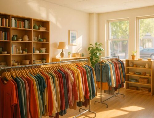
2. Add Space Near Store Entrance
Once you’ve crafted an inviting window display, it’s time to turn your attention to the entry area. The first 5 to 15 feet inside the entrance is a critical zone where customers transition from the outside world into your store’s environment. Studies reveal that 64% of shoppers will leave without purchasing if the entrance feels chaotic or disorganized.
Create a Welcoming Transition
Your store’s entry should feel open, clear, and inviting. This space sets the tone for the shopping experience and helps customers ease into the environment. Visual Merchandising Consultant Sarah Manning highlights the importance of simplicity:
“Typically they tend to have too much out, so the quantity is probably wrong. If it’s so heavy with product quantity, firstly it undervalues the product, and secondly, it makes it unshoppable… I think often the floor layout can be slightly wrong. Particularly with smaller store, often it’s quite cluttered, with lots of blocks to block the flow.”
Strategic Product Placement
Once you’ve established a clean and welcoming entry, use this space to subtly guide customers. Research shows that most shoppers instinctively look left and then right when entering a store. You can use this behavior to your advantage by:
- Keeping the first 15 feet free of clutter and positioning eye-catching, high-demand items in this area.
- Use gentle, well-placed lighting to create a calming atmosphere.
- Adding clear, directional signage to help customers navigate deeper into the store.
As one expert puts it:
“The entrance to your store is the first impression you need to get right, and sets the tone for the experience any customer goes on to have in store.”
An uncluttered, thoughtfully designed entrance not only makes a great first impression but also helps customers feel more confident and comfortable as they explore your store.
3. Use Angled Aisles for Better Flow
Once you’ve nailed a clutter-free entrance, the next step is designing aisles that encourage smooth navigation. Angled aisles not only improve the flow but also highlight your merchandise, creating a shopping experience that feels natural and engaging.
Why Diagonal Layouts Work
Angled aisles, often set at 45°, offer a clear advantage over straight ones. They provide better visibility across the store, making it easier for customers to spot products. Plus, they discourage shortcuts between sections, keeping foot traffic steady and purposeful.
Tips for Optimizing Angled Layouts
Here’s how you can make the most of a diagonal aisle design:
- Direct the Flow: Arrange your aisles to guide customers toward key displays, almost like an arrow pointing them to featured products.
- Leverage Corner Displays: Corners are prime real estate. Stock them with eye-catching or seasonal items that draw attention as shoppers move through the store.
- Keep It Comfortable: Make sure there’s enough space for customers to move easily, even if they’re pushing carts or carrying larger items.
Making It Work in Your Store
To implement angled aisles, flexibility is key. Use movable racks and tables to test different layouts, adapting to changes in inventory or seasonal promotions. Many retailers find that tweaking angles and placements increases customer interaction with products. The diagonal layout doesn’t just guide shoppers – it creates a unique shopping experience that naturally leads them toward the checkout counter.
At City Thrift, we’re always refining our layouts to ensure customers can explore our wide variety of secondhand treasures with ease and enjoyment.
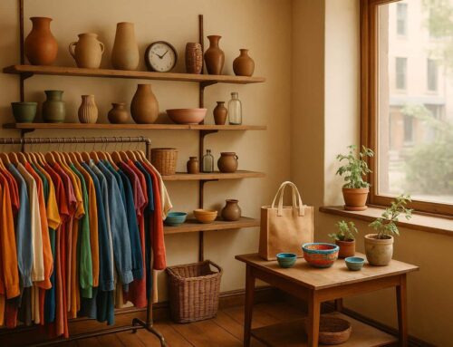
4. Set Up U-Shaped Product Sections
U-shaped product sections are a smart way to create inviting spaces that naturally draw customers in. This layout not only organizes merchandise into clear categories but also makes the most of the available space.
The Psychology Behind U-Shaped Layouts
This design feels like a welcoming embrace, encouraging shoppers to explore more deeply. It taps into natural human tendencies, making the shopping experience more engaging and enjoyable.
How to Create Effective U-Shaped Zones
U-shaped zones combine functionality with flow. While angled aisles help direct traffic, the U-shape organizes products in a way that invites discovery.
Central Display Area
The center of the U-shape is perfect for showcasing featured products or seasonal collections, grabbing attention right away.
Side Wings
The “arms” of the U-shape create intuitive pathways, leading customers through related product categories and maintaining logical groupings.
Maximizing Space and Efficiency
This layout is popular in warehouse settings for good reason. It optimizes inventory management and streamlines operations.
Tips for Making It Work in Your Store
To get the most out of U-shaped layouts, consider these practical steps:
- Use circular signs above each U-shaped section to identify product categories, and arrange existing furniture to shape these zones.
- Designate areas for bargains or “treasure hunts” to keep customers engaged.
- Opt for modular display units that can be reconfigured for seasonal changes.
What makes U-shaped layouts so effective is their flexibility. They work equally well for small displays or larger department setups, helping you create an efficient and customer-friendly shopping environment.
5. Place the Checkout Counter Effectively
The placement of your checkout counter plays a big role in shaping customer flow and overall experience. 70% of shoppers form negative impressions based solely on their checkout experience.
Best Spot for the Counter
Position your checkout counter on the front left of the store. Why? Most customers naturally enter on the right and exit on the left. This layout creates an intuitive flow, reduces congestion, and makes the shopping process smoother.
How Much Space Is Needed?
Ensure there’s at least 30–40 inches of clear space in front of the counter. This gives customers enough room to approach and complete their purchases comfortably. Once this space is secured, you can focus on configuring the counter to further improve efficiency.
Counter Configurations to Match Your Store
Different store sizes require different checkout setups. Here’s a quick guide:
| Configuration Type | Ideal For | Benefits |
|---|---|---|
| Single Counter | Small shops | Saves space in compact layouts |
| Dual Cash Wrap | Medium stores | Handles multiple transactions efficiently |
| Three-Part Setup | High-traffic areas | Serves more customers simultaneously |
Creating a Smooth Checkout Experience
For larger stores, having multiple checkout stations can prevent long lines and keep customers happy. Business consultant Lynn Switanowski highlights the importance of simplicity at checkout:
“Such products don’t need a lot of explaining. It sells itself (because) you understand what it does”.
Studies also show that relaxed customers tend to spend 12% more than the average shopper. To encourage this, keep the checkout area well-lit, organized, and free of clutter. An inviting and efficient checkout counter not only enhances the shopping experience but also encourages repeat visits, setting the stage for more successful merchandising efforts.
6. Change Feature Walls by Season
Seasonal feature walls can breathe new life into your store and create a more engaging shopping experience. These walls act as prime real estate for showcasing products, and keeping them updated with seasonal themes can drive customer interest and spur impulse purchases. Research shows that 40% of seasonal sales come from spur-of-the-moment buying decisions. By regularly refreshing your feature walls, you ensure your store stays vibrant, relevant, and inviting.
Timing Your Updates
Retail expert Bob Phibbs recommends updating product displays monthly to maintain customer interest and avoid display fatigue. A well-planned seasonal rotation schedule can help you stay on top of these updates and align with inventory changes:
| Season | Key Items to Feature | Timing for Updates |
|---|---|---|
| Spring | Pool gear, shorts, tank tops | April–May |
| Summer | Outdoor equipment, light clothing | June–August |
| Fall | Coats, mittens, winter clothing | October–November |
| Winter | Holiday decor, cold-weather items | December–January |
These timely updates keep your store’s atmosphere fresh and seasonal, encouraging repeat visits.
Display Elements
- Location matters: Place seasonal displays in high-traffic areas, like near the entrance, to immediately draw attention to timely merchandise.
- Seasonal color schemes: Match your displays to the season. For example, use red, white, and blue for Independence Day and pair patriotic home decor with themed clothing.
- Color-coded pricing: Introduce a color-coded price tag system for seasonal items. This makes markdowns (up to 50% for holiday promotions) and end-of-season clearance easy to manage while helping you track inventory movement efficiently.
Maximizing Seasonal Impact
To make the most of your seasonal displays:
- Use strategic lighting to highlight key products.
- Rotate merchandise regularly to keep the display fresh.
- Track performance and tweak your approach based on what works best.
With 88% of shoppers now placing more emphasis on conscious consumption, you can tap into this trend by incorporating seasonal second-hand items. Highlighting their value and sustainability can make your store stand out while appealing to eco-conscious customers. By thoughtfully curating your feature walls, you’re not just selling products – you’re creating an experience.
7. Use Movable Display Units
Movable displays grab shopper attention five times more effectively than standard in-aisle product placement. These versatile units are essential for creating a flexible store layout that improves customer flow and adapts to inventory changes.
Strategic Display Options
Movable displays come in many forms, each designed to enhance both visibility and practicality. Examples include heavy-duty garment racks for clothing, adjustable shelves for home goods, and rolling carts for smaller accessories. These options allow stores to showcase products in dynamic and engaging ways.
Maximizing Display Effectiveness
Heidi S. from STADIO DPL highlights the importance of skilled staff in creating impactful displays:
“The most cost-effective strategy is having skilled staff who understand the role of the store environment and can implement trends, design principles and elements, and visual merchandising tools effectively, supporting retail and brand operations as required.”
Implementation Tips
Here’s how to make the most of movable displays:
- Traffic Flow Analysis
Study how customers move through the store and adjust display placement to create clear pathways while ensuring products get maximum exposure. - Seasonal Transitions
Wheeled displays make it easy to refresh layouts for seasonal changes. Marketing strategist Tonya Mangels suggests:“Refreshing store displays on a budget can be achieved by creatively reconfiguring existing materials and strategically changing one core element. Consider rearranging product placements, adjusting lighting angles, or experimenting with new color schemes to provide a fresh look.”
- Data-Driven Decisions
Use sales data and customer feedback to identify which display positions work best. This approach ensures your layout aligns with shopper preferences and performance metrics.
Keep displays customer-friendly and easy for staff to restock. Place heavier items on lower shelves and maintain clear sightlines throughout the store. Movable displays not only improve product visibility but also make navigating the store a smoother experience.
Conclusion
A well-thought-out store layout doesn’t just improve the shopping experience – it directly impacts sales and customer satisfaction. Research highlights this connection, revealing that stores with optimized layouts see a 15% increase in sales, while cluttered or poorly organized spaces can lose up to 64% of potential customers.
The strategies discussed earlier help create an inviting atmosphere where customers feel encouraged to explore and engage with the space. Key benefits include:
- Helping customers navigate and discover products with ease
- Encouraging longer visits and increased dwell time
- Streamlining operations for smoother functionality
- Highlighting seasonal or promotional items effectively
- Maximizing space through adaptable, flexible displays
But the impact of a smart layout goes beyond just numbers. For example, at City Thrift, every purchase contributes to community programs supporting those in need, such as initiatives addressing homelessness and poverty.
In short, an optimized store layout doesn’t just enhance business performance – it becomes a tool for making a meaningful difference in the community.
FAQs
What are the best ways to make my thrift store’s window displays attract more customers?
To make your thrift store‘s window displays stand out and draw in new customers, focus on keeping them vibrant, well-organized, and inviting. Switch up your displays often to highlight seasonal pieces, fresh arrivals, or themed collections that align with current trends or holidays. Incorporate bold colors and imaginative layouts to catch the eye, and use clear signage to emphasize your store’s thrift appeal.
Organizing items into themes or categories – like trendy clothing, home décor, or kids’ toys – can help people instantly grasp what your store has to offer. A tidy, uncluttered window not only makes your items pop but also tempts potential shoppers to come inside and explore further. By consistently curating engaging displays, you can showcase your unique finds and keep foot traffic flowing.
Angled Aisles and U-Shaped Layouts: Enhancing the Shopping Experience
How can angled aisles and U-shaped layouts improve my thrift store’s flow and customer experience?
The way a store is laid out can significantly impact how customers feel as they shop. Angled aisles are a fantastic choice for improving visibility. This design allows shoppers to see more products at once as they move through the store, creating a natural flow that feels intuitive and comfortable. It also makes efficient use of available space, letting you showcase more items while maintaining an open, inviting atmosphere.
On the other hand, U-shaped layouts are excellent for creating focal points that draw attention and invite exploration. This design naturally slows foot traffic, giving shoppers more time to engage with your displays. To maximize its impact, consider placing bestsellers or seasonal items at the ends of the U-shape. This not only catches the eye but also subtly guides customers further into the space. Together, these layouts help create a shopping environment that feels both organized and welcoming.
How often should I refresh my store’s seasonal displays, and what are some creative ways to keep them appealing?
To keep your store’s seasonal displays fresh and engaging, try updating them every 4–6 weeks. This timing aligns perfectly with seasonal shifts, keeping customers intrigued and eager to discover what’s new.
Here are some ideas to help your displays shine:
- Use seasonal colors and themes that reflect the time of year, like earthy tones for fall or vibrant pastels for spring.
- Showcase standout items – whether they’re unique or in high demand – right up front to grab attention.
- Tie in local events or holidays to build a stronger connection with your community.
- Ask for customer input to see what draws their interest and use that feedback for future setups.
By keeping your displays updated and thoughtfully designed, you’ll create a welcoming shopping environment that encourages repeat visits.

Leave A Comment